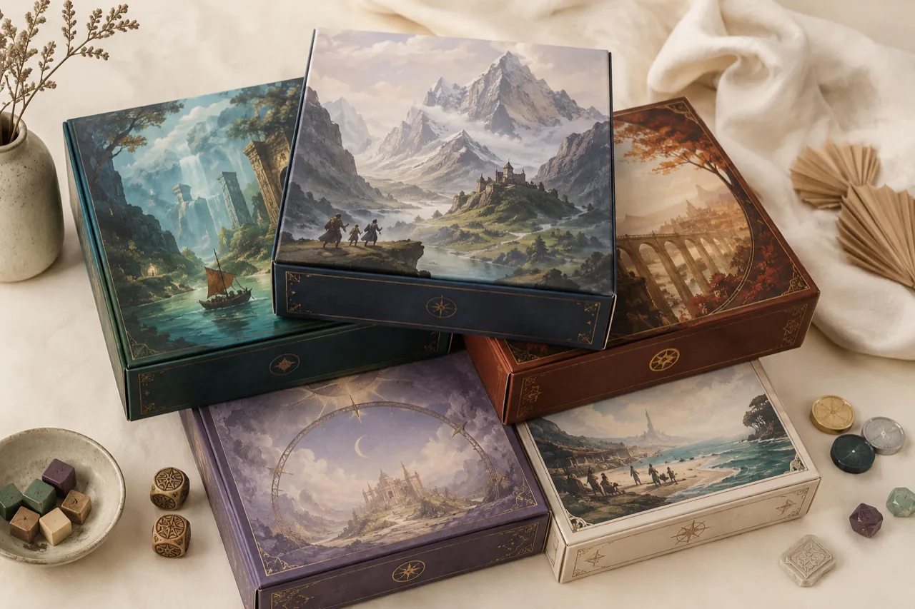
Stand in front of a wall of board games at a shop and you're really looking at a wall of arguments. Each box has a few seconds to tell you what kind of experience lives inside, who it's for, and why it deserves a slot on your shelf. Long before the rulebook gets a chance, the cover has already made its case. Box art isn't decoration; it's the first and loudest piece of the design.
The cover is a promise
Good cover art sets an expectation the game then has to keep. A sweeping painted vista promises adventure and weight. A clean, geometric cover with two bold colours promises something sharp and quick. When the art lies — when a light filler game wears the costume of an epic — players feel quietly cheated even if the game is fine. The most respected publishers treat the cover as a contract about tone.
Reading the shelf at a glance
There's a whole visual grammar working on you that you rarely notice. Typeface, colour temperature, how busy the composition is, whether there are people on the cover or just objects — these cues tell experienced buyers whether a game is a party night, a brain-burner, or a family afternoon. Designers and publishers fight over these choices for months because that split-second read is often the difference between a pickup and a pass.
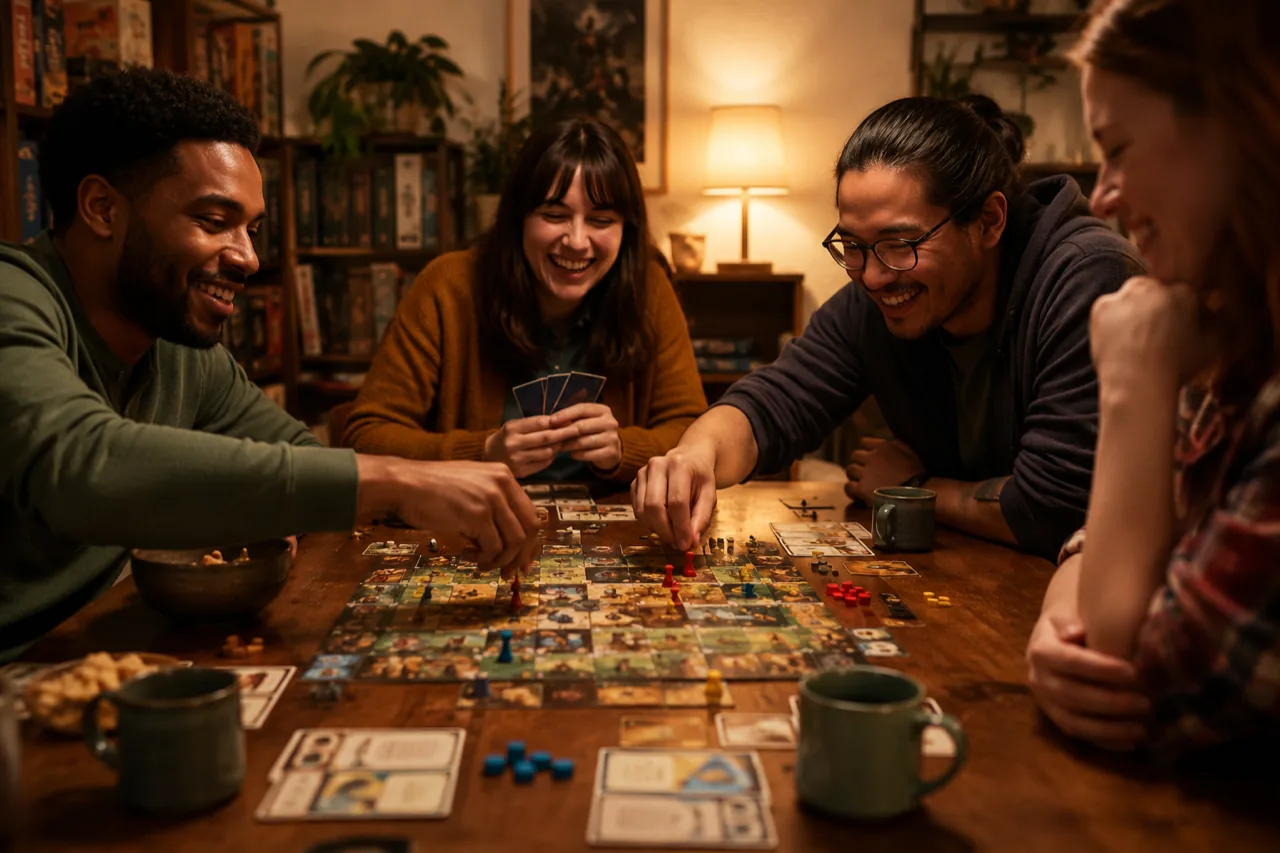
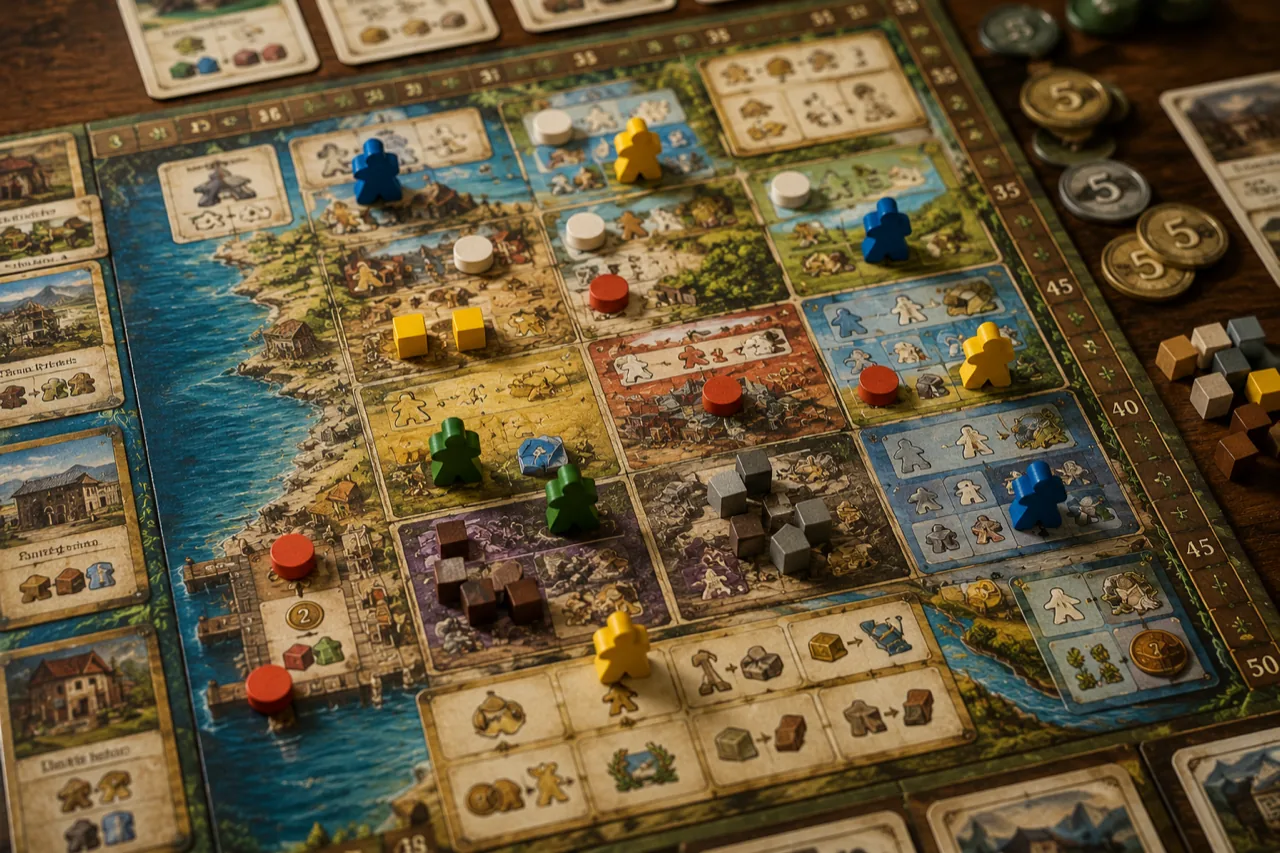
Inside the box counts too
The craft doesn't stop at the lid. The moment you open a great box and find a sensible insert, punchboard that pops cleanly, and components that feel good in the hand, the design keeps making its promise. A thoughtful box tells you the people who made it cared about the hour you're about to spend. That care, communicated before a single rule is read, is the quiet art of the game box.